Chapter 6
The Future of Dashboard Design
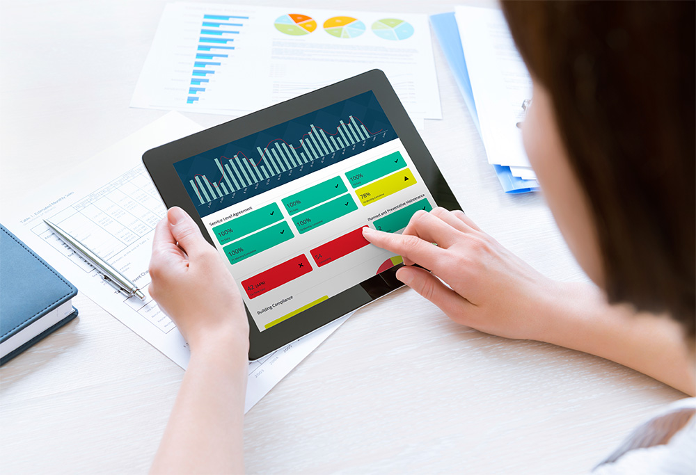
Dashboards transform dull and sometimes opaque data into visually stunning insights that resonate with a wide range of users.

Dashboards transform dull and sometimes opaque data into visually stunning insights that resonate with a wide range of users. The truth is, businesses that do not have these deep capabilities in data comprehension will ultimately be replaced by those that do.
Like any technology, dashboards are constantly evolving. As you create impactful dashboards at your organization, it’s important to stay on top of the latest design trends. Here are the key trends—many of which we’ve already discussed in this guide—that are driving dashboard design today and in the coming years:
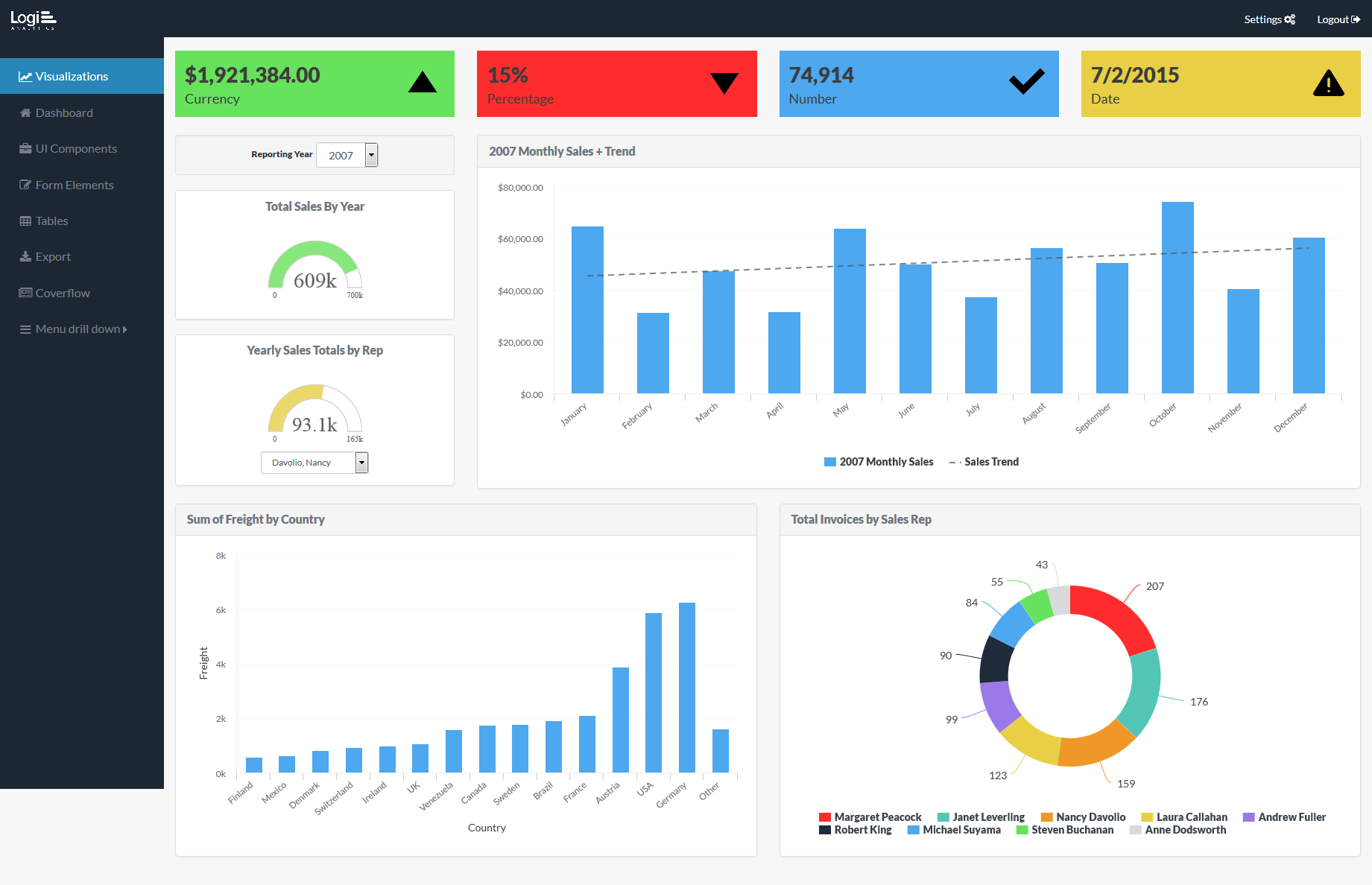
Flat UIs have become fundamental to creating successful user experiences because they offer a straightforward approach to design. Utilizing two-dimensional illustrations and minimizing the use of shadows, gradient textures, and three-dimensional treatments is aesthetically pleasing and helps users process content quickly without distraction. With the advent of Windows 8, iOS7, and Google Material, this trend isn’t going away anytime soon.
Did you know that 37 percent of website visits in 2015 came from mobile web browsers? For several years now, designers have been forced to re-evaluate the user experience to accommodate the growing mobile trend. Their constant challenge is how to replicate the same content usually seen on desktop devices on mobile. Ultimately, desktop and mobile apps shouldn’t compete, but rather complement one other. For instance, mobile dashboards should include features that allow remote workers to be fast, agile, and simple: responsive design, scrolling, and swiping, to name a few.
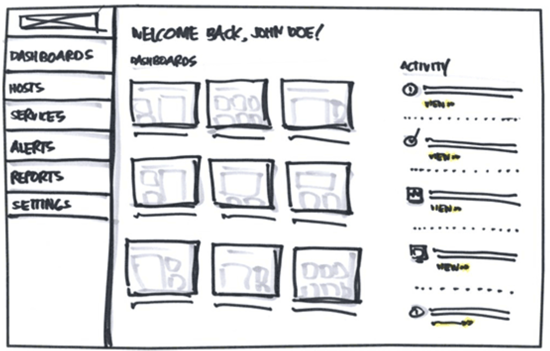
As mentioned in Chapter 1, a wireframe is a base framework to organize your dashboard components. Users who know what information they want to display use it to convert their data into visualizations. Part of wireframing is implementing uniform sizing, which helps reduce distractions because users can identify dashboard features easily, and also helps make the design process less iterative. Every dashboard today should start with a wireframe.
Example: Zurb.com
We see a growing problem with the use of color on dashboards these days. There’s often either too much of it, making the dashboard visually overwhelming, or too little of it, producing a boring dashboard. The best way to engage users is through “colorblocking”: balancing monochromatic background colors against bright colors to highlight important insights or anomalies in the data.
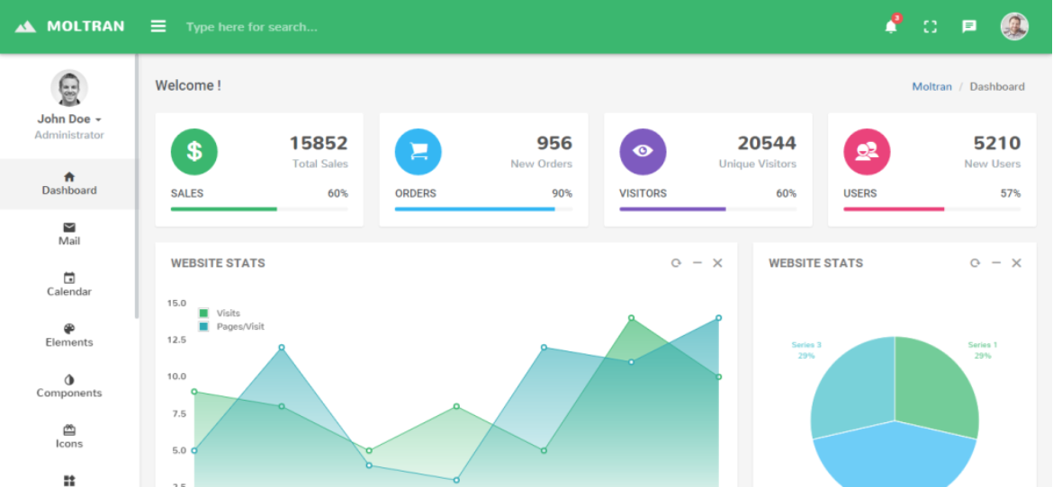
Dashboards should always deliver actionable insights on information that’s relevant to their purpose and audience. Minimize the use of logos, as they take up valuable real estate. As we discussed, use wireframing to provide more reliance on typography and simple, clean graphics. Carry that principle over to your visualizations by using simple charts and tables rather than complex graphics that can be difficult to read. Some designs are even moving toward almost no visible text at all, relying instead on images and icons to convey important information.
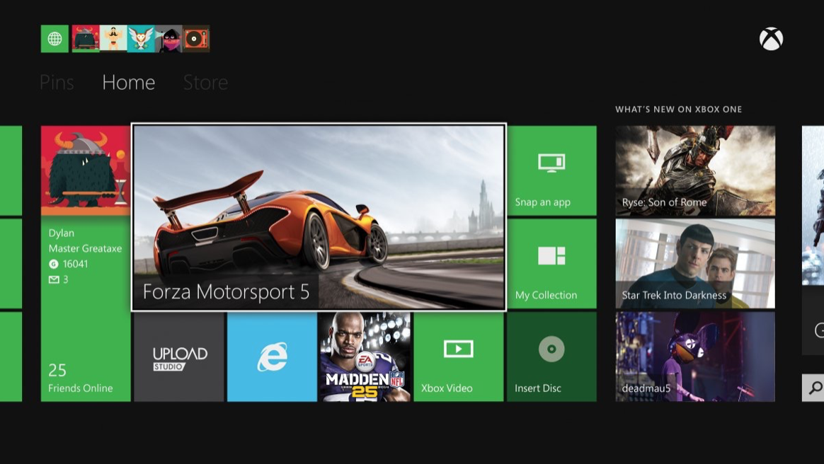
Example: Xbox
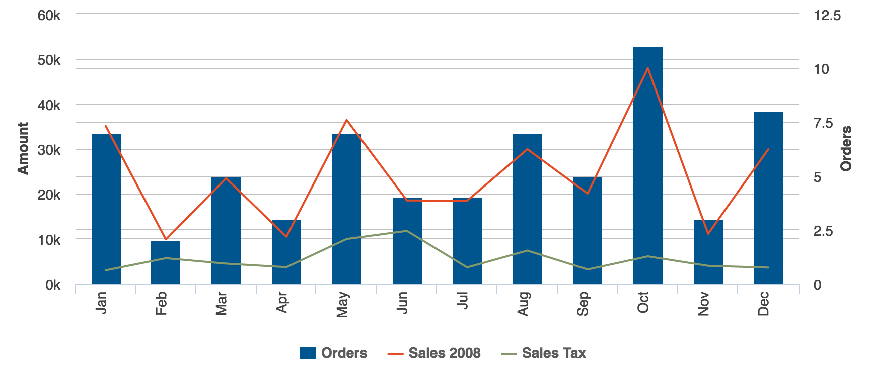
Ten years ago, gauges were considered dashboard eye candy. The intention of this chart type was pretty straightforward: If people could quickly glance at a speedometer or odometer in their cars, then this visualization could translate to BI. However, as we mentioned in the chapter on visualizations, gauges have fallen out of favor because they take up valuable space but present data on only a single dimension. A gauge will tell you whether something is on target, above target, or below target—but nothing more.
Alternatives to gauges include line charts to show trends over time, bar charts to show comparisons, and bullet charts to show targets. You can even use a combination of several types.
To support a great user experience, dashboards are more frequently being integrated with labeled icons in the navigation pane. These consist of small graphics or images followed by short descriptions so users know exactly what they are looking at. Familiar icons enable users to work more efficiently and take action quickly.
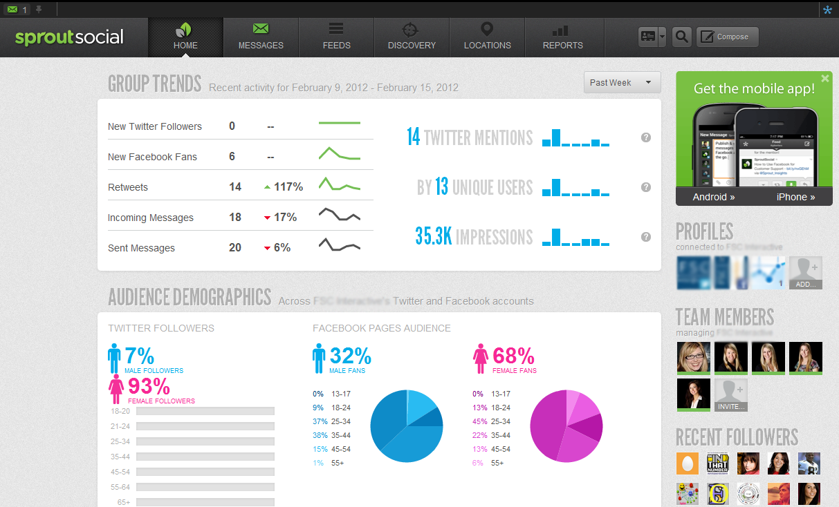
Example: Sprout Social
A dynamic dashboard provides owners or authors with the ability to seamlessly update and add new content. This includes importing/exporting abilities, customizing dashboard views via drag-and-drop functionality, and integrating with platforms or existing web technologies like Salesforce or Google Analytics. Without a dynamic dashboard, you have no easy way to make necessary updates—and that will limit your capabilities in the future.
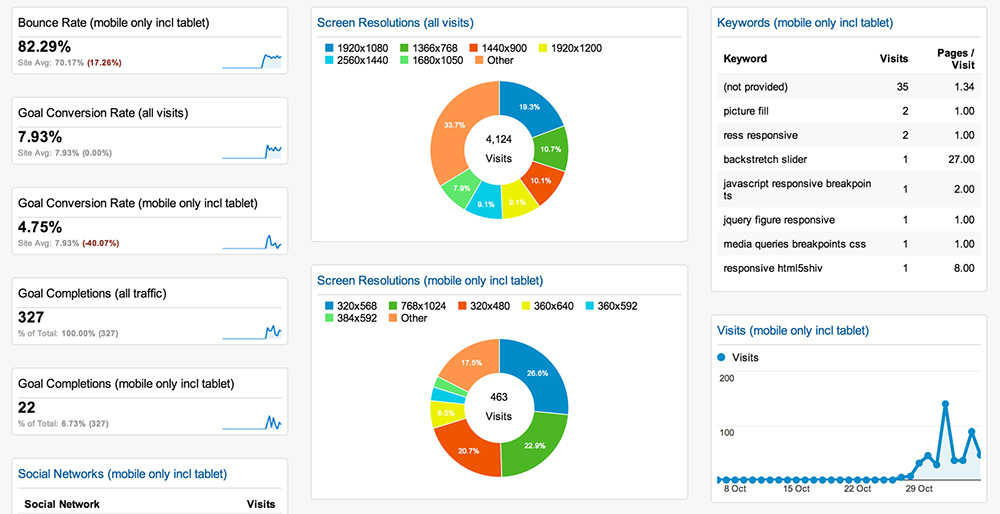
Example: Google Analytics
Today’s dashboards are leveraging rich content experiences through interactive elements like video, light boxes, overlays, slicers, and more. Capabilities such as zooming, drilldowns, and filtering are becoming more commonplace, as well. Some dashboards even utilize social feeds to heighten brand loyalty and deliver real-time actions. All of these interactive features help promote user engagement, and in turn, help people derive further insights from the content.
Historically, dashboards incorporated maps to visually represent performance metrics based on geography. Now, with the steady advent of GPS technologies embedded into devices, location mapping has become more intelligent. Dashboard users should be able to answer location-focused questions quickly—for example, the most accessed resources across campus or the total miles traveled by country.
If you’re new to design or simply feeling overwhelmed, don’t worry. There are plenty of free resources to help you enhance your modern dashboard design and keep up with the latest trends. Here are our favorites:
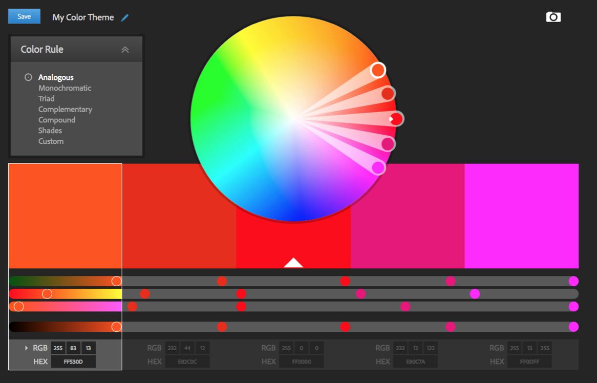
Adobe Kuler Color Wheel: Create your own color schemes or browse thousands of other color combinations from the Adobe community. If you’re stuck, you can use sample colors from an image usually done through Adobe Photoshop or Adobe Illustrator. Color.Adobe.com/Create/Color-Wheel
Colblindor: This complete resource on colorblindness includes a free app that checks the type and severity of a user’s vision efficiency. Color-Blindness.com
Colors: Not sure about your color choices? Start with this suggested color palette for the web. CLRS.cc
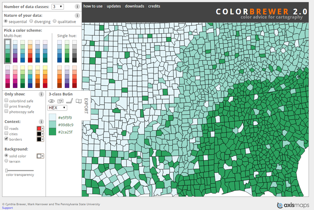
Color Brewer: Easily choose color schemes for visuals and other graphics using pre-selected color sets that have been tested for color blindness and contrast. ColorBrewer2.org
Designer’s Toolkit: This comprehensive assessment helps you select the best prototyping tools for web, mobile, and desktop. cooper.com/prototyping-tools
Font Pair: Everything you need to know about pairing Google Fonts together. FontPair.co
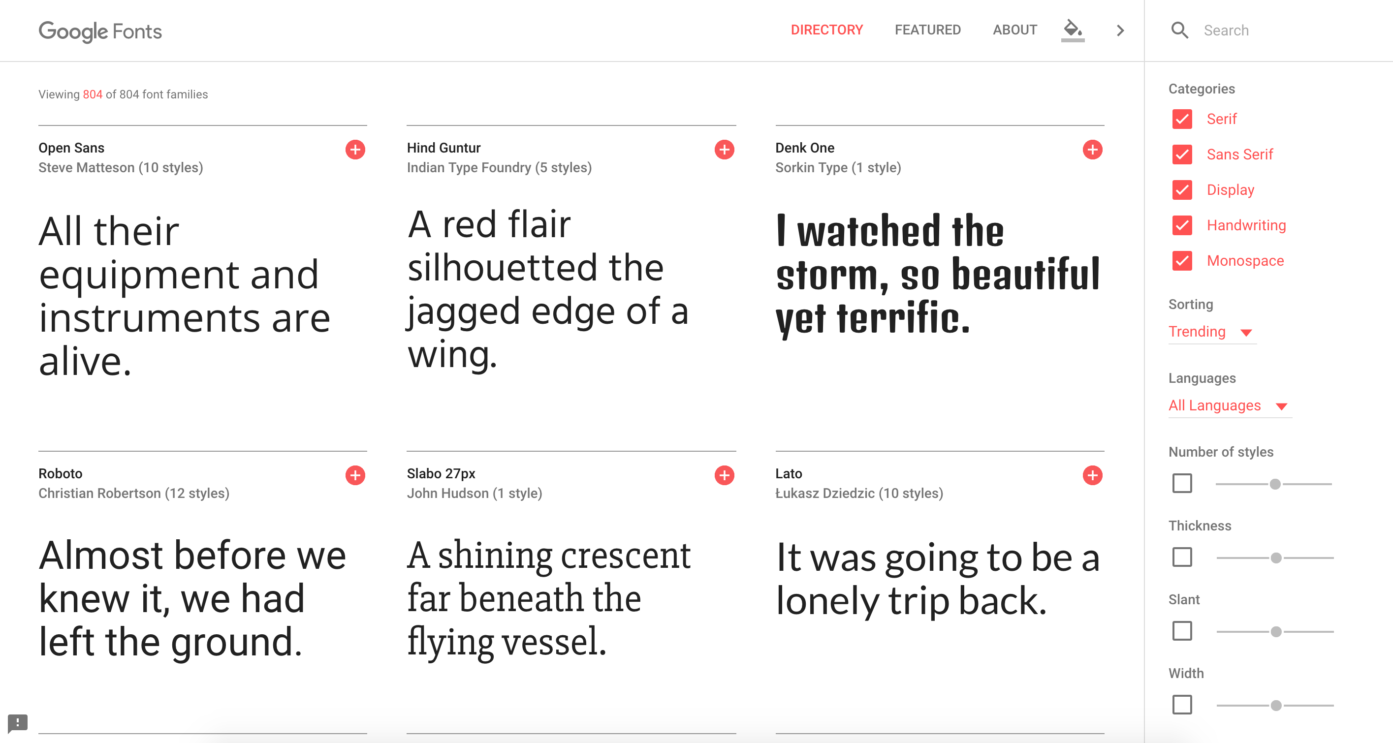
Google Fonts: This interactive directory of free and hosted app programming interfaces (APIs) for web fonts enables you to customize weights, styles, etc. and then integrate the fonts right into your CSS. google.com/fonts
Paletton: Create palettes of colors that work well together according to classical color theories. You can even use the live colorizer to try out your choices within your own projects. Paletton.com
Vischeck: This color blindness simulator is essential to ensuring that all users can clearly see your dashboards. Simply run it on your image files or a webpage to simulate colorblind vision. VisCheck.com
Before you set your design in stone, use this handy checklist to ensure your dashboard meets the best practices we’ve discussed throughout this guide.