Chapter 5
Examples of Beautiful Dashboards
Visual design, usability, and psychology all play a part in how we should design user interfaces for dashboards.

Your dashboard’s UI should meet the needs of your users with simplicity and elegance. Once you have a first version, ask yourself:
Following these basic design principles—contrast, repetition, alignment, and proximity—will help you develop the most effective and user-friendly dashboard UIs. Let’s look at some examples of beautiful dashboard design that embody each principle.
As we mentioned in Chapter 1, contrast is a way to visually distinguish and highlight important content. In analytics, we’re creating data-driven content to communicate a point, and contrast can help us do this. It’s almost as if you’re standing next to the person looking at a chart, yelling in their ear, “Look at Bob’s performance last quarter—his KPI bar, it’s bright red! It’s jumping off the page at you! We need to work on this.”
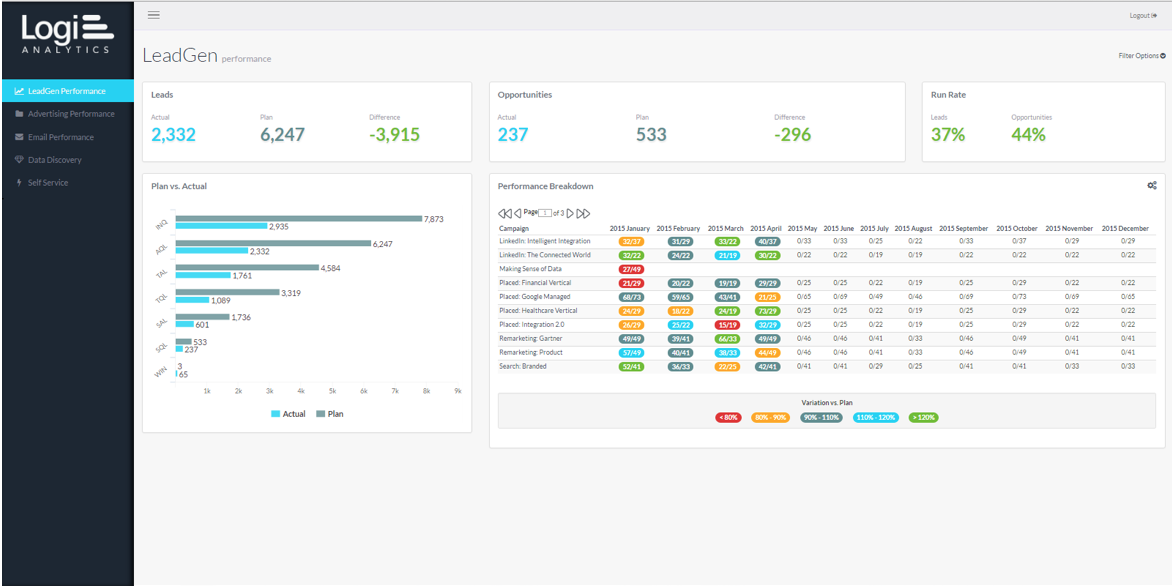
This marketing dashboard leverages contrasting colors to make its point. In the lead generation tab, we can see the actual number of leads and opportunities versus the planned numbers for each, and the numbers change color based on performance.
The same principle applies to the other tabs. For advertising campaigns, the app shows the number of impressions and breaks it down by cost per lead, cost per clicks, and cost per opportunity. It also measures specifics of email campaigns, including open rate, bounce rate, cost per lead, and cost per opportunity. While this is a very number-oriented dashboard, its use of contrast makes it visually appealing and highlights the most important information.
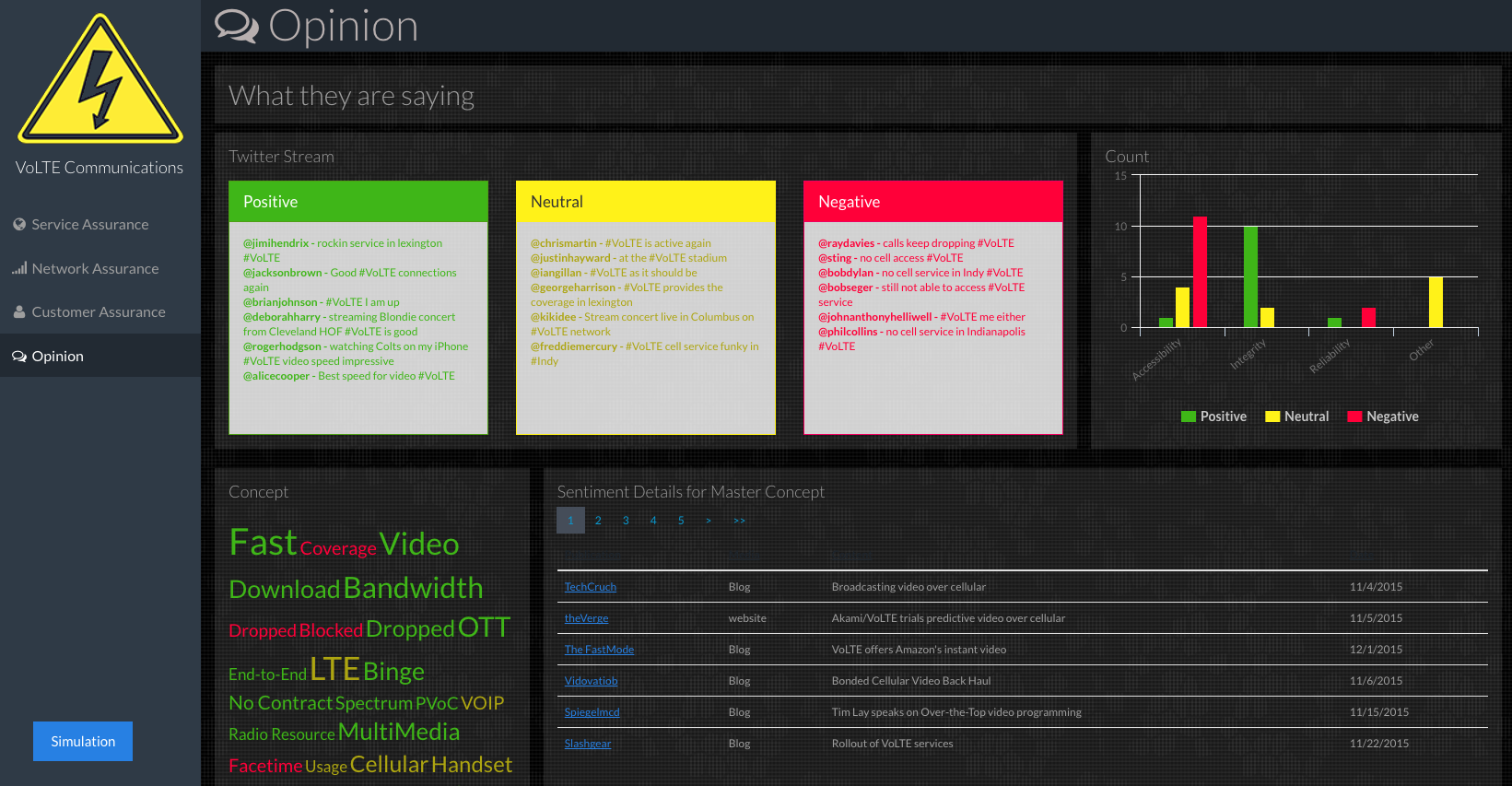
This example shows you the other side of the spectrum in terms of color usage. You don’t always have to use grey and white hues. In certain cases, darker colors allow your other colors to come forward and present in a more consistent fashion. In this dashboard, we have color cues; once a specific threshold is reached, the whole panel turns a color like green. This design technique is useful when you want to monitor what information is trending. Once a panel passes the set threshold, the whole cube or square could light up. Think about very dark colors and very light colors and how each will contrast with the colors of your brand.
Repetition in design means keeping the look and feel consistent. Repetition applies internally to your user interface and even to individual visualizations. For instance, if you have a set of bars that are all one color and you highlight one, you would use this same practice in other charts to show that this highlight is corresponding, or they have some relationship.
Repetition also means making your dashboard’s user interface consistent with users’ expectations. This is why dashboard UIs that mimic popular websites like Pinterest are particularly effective: Today’s users are accustomed to interacting with data by clicking, dragging, dropping, tagging, commenting, and following. They’ll naturally hover their mouse over fields to reveal more details, and they’ll appreciate the ability to filter a dataset in order to display more specific data. By using familiar buttons, links, fonts, and layouts, you’ll eliminate a lot of the learning curve right off the bat.
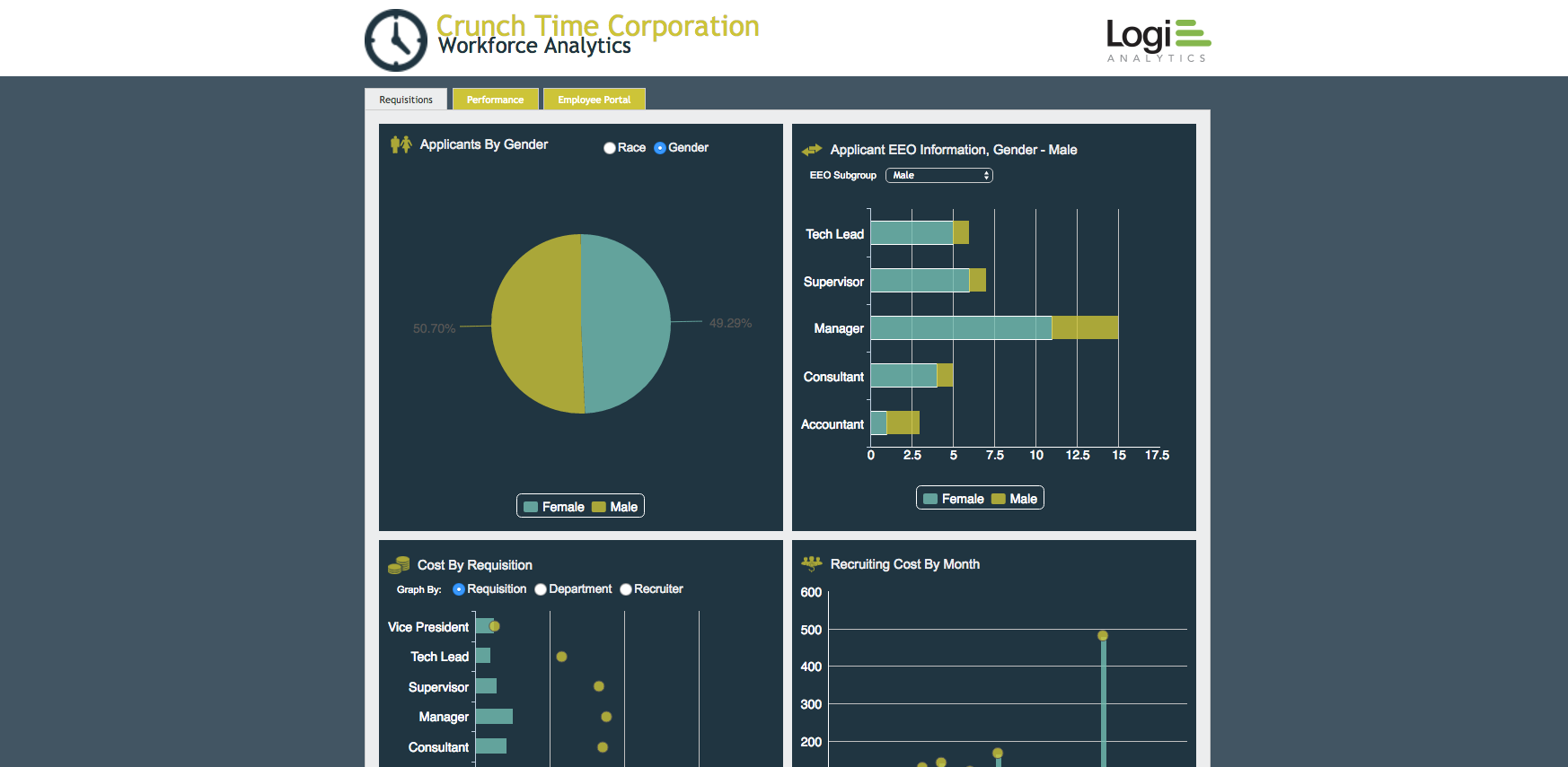
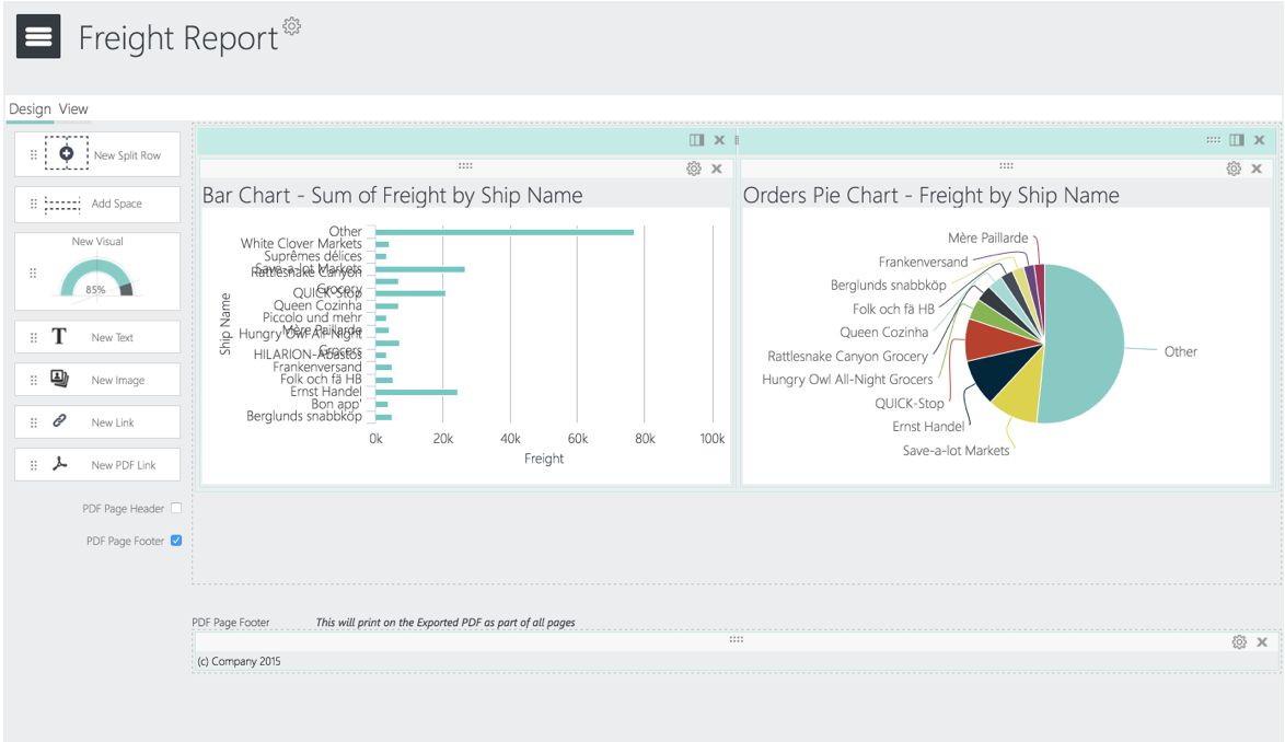
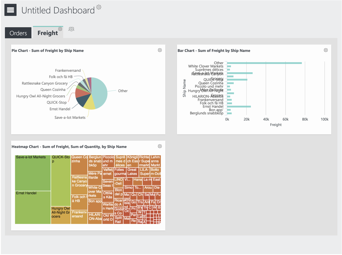
This workforce analytics dashboard is entirely made up of visualizations, so its use of repetition is key to a good user experience. While it includes several different types of charts, the characteristics and sizes are consistent: The legend is always in the same position, and the titles are in the same format and style. The visualizations are also aligned in a grid, making for a simple and straightforward UI that users can easily understand at a glance.
One of the most straightforward ways to organize design for a BI tool is to align it to a grid (or wireframe, as previously discussed). Incorporating horizontal and vertical alignment between every element helps reduce distractions and enables users to easily identify dashboard features.
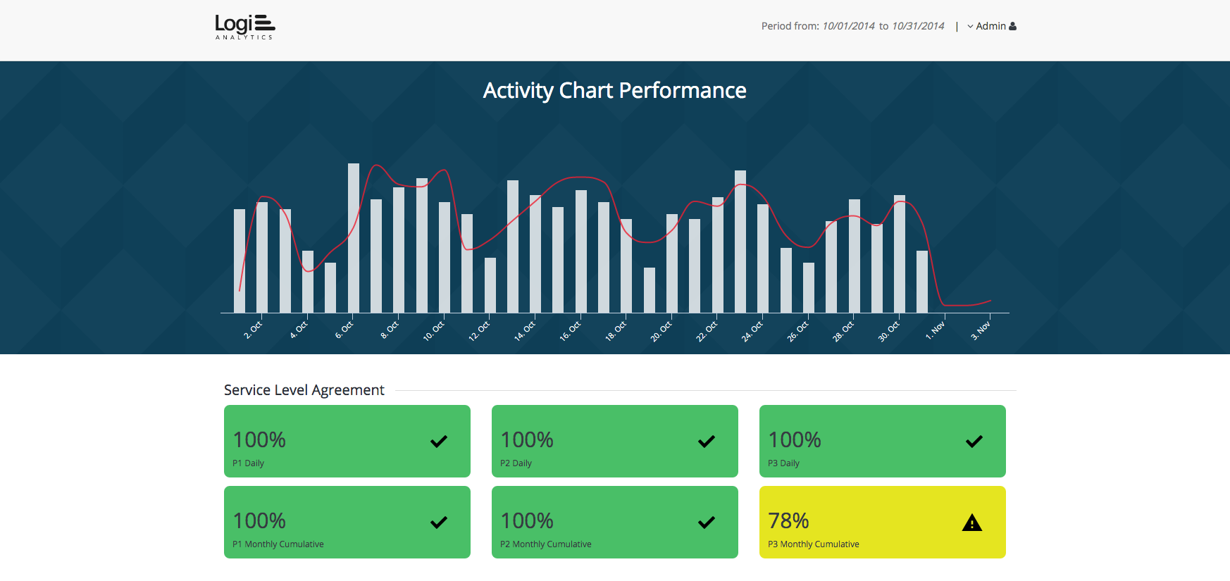
This facility management dashboard exhibits several design principles to measure activity related to service level agreements, building compliance, risk management, energy management, and process management.
First, it uses contrast to show the status of all available assets at a glance. For example, the cooling towers in the plant room are at 90 percent working condition and therefore have a status of good (green). Second, since this dashboard UI features a number of visualizations, its use of alignment helps the user identify each module quickly.
Proximity refers to visual search (i.e., your eyes scanning the page for information). In a dashboard, you’re providing the tools and organizing them in a way that makes sense to users—and the best way to do that is to group like with like. In doing so, we’re influencing our users’ mental model.
Instead of using every single piece of real estate, the rule of proximity dictates that you include padding, margins, and space for your elements to breathe. Aligning the white space and organizing elements into groups will help users easily digest what they’re seeing. For example, if you want two things to appear related to each other—like a series of rows—you want to place them close together, but not too cramped, so your eyes can follow them.
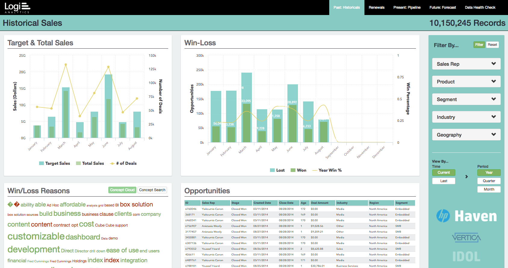
This sales dashboard uses fewer colors and visualizations than most. Instead, it relies on proximity to organize different lists into digestible groups. These datasets include historical sales, present sales, future sales, and renewals against targets. To keep the layout simple, the app also makes use of filters, which enable users to drill down by sales rep, product, segment, industry, and geography.