Chapter 3
Designing for Mobile
Mobile is changing the way we live. Whether we’re working, reading the news, or purchasing goods, we’re doing it all on mobile devices.

Mobile is changing the way we live. Whether we’re working, reading the news, or purchasing goods, we’re doing it all on mobile devices. According to estimates by Mobile World Live, by 2020 individuals worldwide will use an average of 4.3 internet-connected devices on a daily basis.
So what does mobile mean for BI? It means dashboards and reports must be designed to deliver information in an easier, more consumable way. Because we’re dealing with non-traditional interfaces—and consequently, less real estate—it’s more important than ever for this information to be meaningful.
The goals you have for your desktop applications versus your (perhaps derivative) mobile applications will likely differ. For instance, your desktop app may be designed to show summary reports with lots of drilldowns for managers, while your mobile app might be used by workers in the field to create orders and fire off emails and alerts.
The functionality, look, and feel for these two applications should be different. For example, many dashboards will have tabs for different types of information, whereas in those designed for mobile, you’ll have a single chart or summary showing what is occurring within the organization.
As you design your mobile dashboards, keep these considerations in mind:
Look for a BI tool that supports both desktop and mobile dashboards so you can reuse as much content as possible without sacrificing functionality or ease of use. Also, make sure your mobile BI design embodies most or all of the following best practices.
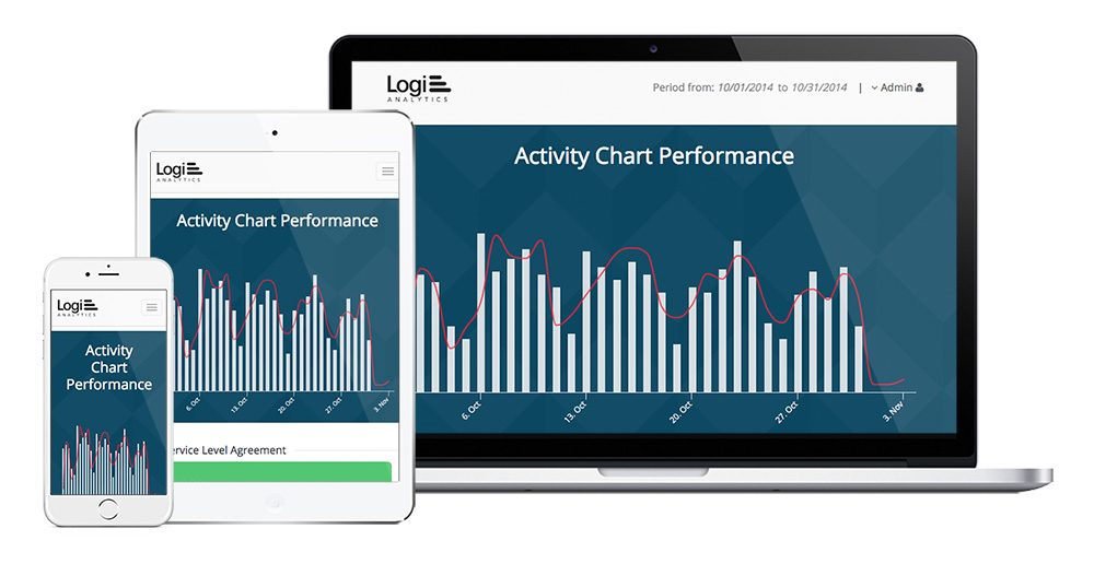
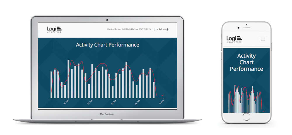
Create applications that are responsive to any device your workers may use. The idea is to deliver the same HTML code regardless of screen size and use cascading style sheets (CSS) to rearrange those elements based on the screen width. This allows you to build one application that will automatically be resized and responsive based on the device.
Whether your users are at the airport, visiting a client, or at home on a Sunday morning, mobile devices are essential to getting the answers they need quickly and efficiently. It’s critical to know who your target user groups are so you can understand when and where they’re likely to access mobile dashboards and reports, and for what purpose. Here are a few sample use cases for mobile BI:
In today’s day and age, people have plenty of options for what to consume and how to consume it. Whether they use a Kindle, a newspaper, or a hardcover book, these platforms all have one thing in common, at least in North America: They are meant to be read from left to right and top to bottom. While this remains an important point for desktop dashboard design, it’s even more essential for mobile. Place the most important details from top left to bottom right. This is where the user’s eyes will naturally start, so get them on the right track.
We’ve all been on our mobile device and tried to touch one thing but ended up selecting something completely different. This can be frustrating and time consuming. Once a user reaches your dashboard, you want to remove these barriers to information consumption—including any click paths to dive deeper and explore other visualizations.
Make sure to incorporate spacing between filters, links, and visuals. The small screens on most mobile devices make it challenging for users to select objects that are right next to each other. Touch targets should be at least 48 x 48 dp (display picture) and they should never overlap. This ensures users will be able to reliably and comfortably target them with their fingers.
As we discussed in Chapter 1, less really is more. The more design elements you have in a report or dashboard, the harder it will be to discern what’s important. It’s often easier to pick out important values from a simple data sheet than a flashy chart with lots of colors and data points. Ideally, you should include just a few distinct elements that will tell your story effectively without distracting the user.
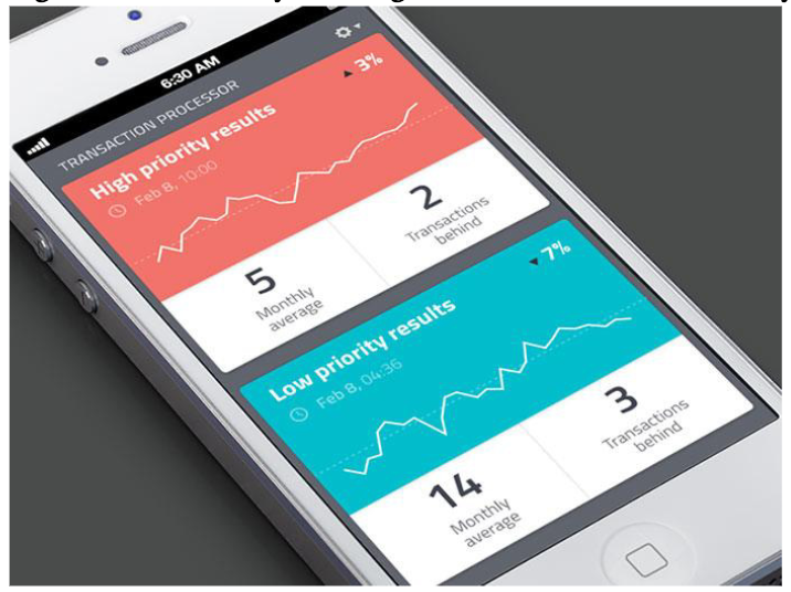
Because mobile devices have less real estate than desktop devices, it’s paramount to create aesthetically pleasing interfaces. One way to do this is by contrasting the background and foreground colors. You may notice that mobile devices tend to have darker backgrounds, with lighter colors representing the objects in the foreground. When it comes to BI applications, this style is crucial. KPIs and outliers stand out more with high contrast, thereby enabling users to find the answers they need at a glance.
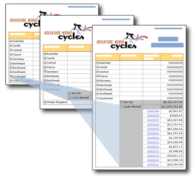
You’ve created a dashboard for a mobile device and it looks great! Now it’s time to drill down to a detailed report. But if your report has a completely different layout and styling than your dashboard, it can be a jarring and confusing experience for your users. It’s vital to be consistent throughout the entire mobile asset. Providing an intuitive workflow will eliminate confusion and accelerate the learning curve. And keeping the colors consistent across all reports will help tell your story most effectively.
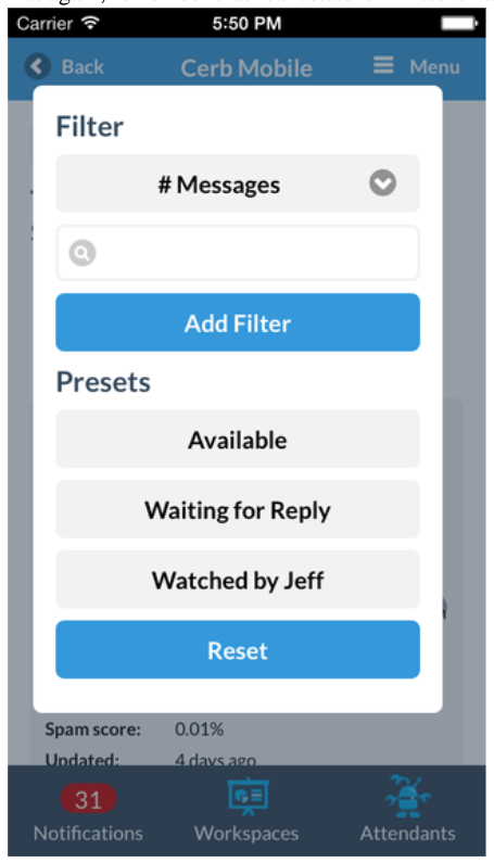
Filters allow users to get different views of data quickly. While you may feature many different filters for the desktop, keep filters on mobile to a minimum. For example, add a search option on a dropdown list to allow users to find the values they need. Providing the right set of filters will help people make better use of mobile dashboards and reports. But again, remember that real estate is limited on a mobile device compared to a desktop.
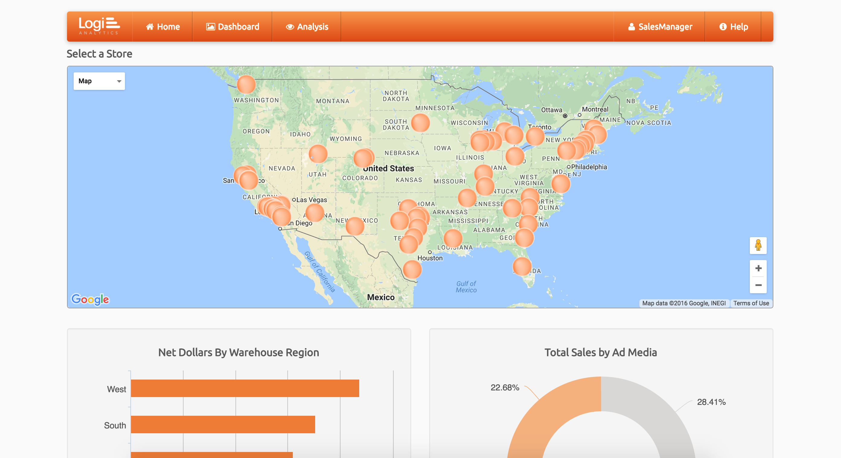
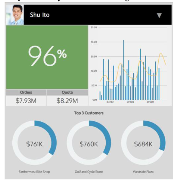
Dashboards are meant to provide a top-level view of the key performance areas for your business. That said, providing a 10-panel dashboard for an audience using smartphones isn’t the best approach. Instead, allow users to focus on KPIs and key outliers and let them decide the direction they want to go from there. Not only does this method help users get the answers they need, it empowers them to be more productive in the business by honing in on the troubled or successful areas.
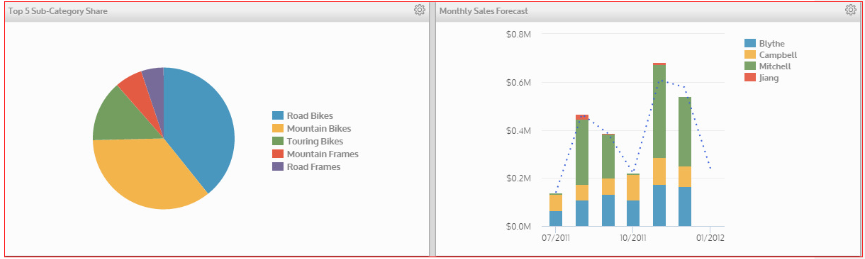
Since you only have a few charts and data tables on your main dashboard view, you must use them wisely. In mobile dashboard design, pie charts and bar charts are great tools for linking to other visuals on the same page or to other reports. Features like tooltips or popup panels can also be very effective for users to get the details they need, especially if they want to stay on the same page.