Chapter 1
Dashboard Design Fundamentals
If you already use reporting software, you may wonder why you need a dashboard at all.

Reports are static. They may provide useful information, but on their own, they show only one piece of the puzzle. What’s more, many users (especially managers and executives) lack the time to decipher what a report or chart means. Reports don’t allow these users to add more pieces of information, dig in to real-time data, or change how information is displayed. Furthermore, reports only include pre-determined datasets.
Dashboards are analytics tools that give users a unified view of the most important data. They consolidate real-time information in a simple, easy-to-understand, and dynamic format. Dashboards are especially useful when you are considering or comparing multiple datasets at a time.
However, a dashboard is only as effective as its design—and that design should be dictated by the needs of your users. That’s why defining your audience is an essential first step in dashboard design.
It’s an obvious but often-missed point: Different users within your organization will want to use analytics in different ways. In other words, they have different needs. To ensure high user adoption, you need to personalize dashboards to your users’ specific roles and skills.
Recognize the different use cases in each department as well as the distinct needs of different users across your organization. We developed the Continuum of Self-Service Analytics framework to help you identify these users. Without such a framework, you’ll be flying blind and run a high risk of failure.
This framework dictates that in any given organization, nearly every analytics user will fall into one of three categories or personas:
 Information consumers: The majority of analytics users fall in this category. These users prefer to work with a predefined dashboard experience where they can regularly view, interact with, and personalize a preconfigured asset.
 Content creators: A creator’s self-service experience is more managed than predefined. These users want the ability to choose the data they need and supplement those existing dashboards and reports with their own metrics.
 Data analysts: An analyst’s experience is entirely self-directed. These power users prefer to bring their own data, build their own dashboards and reports, and mine insights they can share with others.
Once you’ve placed your users into the three buckets above, plan to conduct interviews with each group about their requirements. But first, remember that after dividing all your users into these groups, you may still have a few users who defy categorization. Standards aren’t about eliminating the exceptions, but about carefully managing them. Look for analytics capabilities that fit 80 to 90 percent of use cases, and then deploy specialist capabilities in limited instances to meet the needs of any exceptional use cases.
If you’re feeling intimidated, don’t be! Successful self-service analytics requires an ongoing, iterative process. As the analytics tools meet your users’ basic needs, they’ll get smarter and feel comfortable enough to ask for additional capabilities. Starting small and building as you go will help establish an ongoing governed collaboration between IT and business users—making sure analytics meets the needs of the entire organization.
Now that you’ve defined your audience and come up with requirements, it’s time to create an attractive dashboard that people will actually want to use. Meet the four fundamentals of dashboard design: content, layout, color, and fonts. By manipulating each of these levers, you’ll affect how users interact with your dashboards to understand information and take action.
Keep it relevant. We’ve already talked about the fact that content should be relevant to your audience. Part of accomplishing that is removing everything else. Simplify content and reduce visual elements to only the most critical pieces. If you’re designing a dashboard for a sales team, for example, don’t include visualizations on marketing campaign channels.
Avoid overdesigning. Anything that’s not data in a table or graph should be just visible enough to perform its role—but no more than that. If it’s too obvious, it will take away from the data. Stay away from distracting visual effects such as background gradients, shadows, and 3D elements. Colors and shapes shouldn’t distract, but help you absorb and digest information.
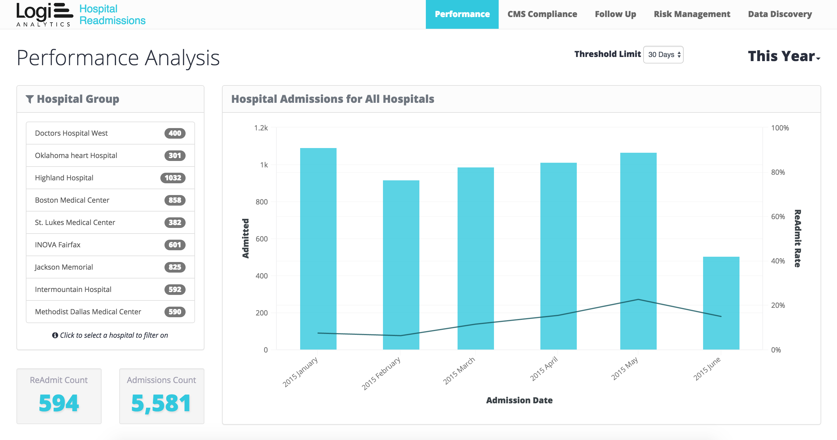
Understanding that there is a limited amount of space to display analytics can make your design more effective. After all, if you’re unable to show everything, you’ll have to identify what is most important. In some cases, this might mean you have separate tabs for individuals who want to look at a variety of information. Placing finance, sales, and help-desk metrics on the same page will only confuse users and won’t provide the data correlations they need to make the best decisions.
Use iconography. Content isn’t limited to text and charts. You also have to think about icons and how they associate with user interaction. For instance, particular icons denote specific actions like close, delete, eject, and hide.
These four actions are similar from a user perspective, but including the icons will help people quickly discern which action to take—making for a more efficient user experience.
Group related data together. Once you know what information your users need, group related data next to each other. Tier your visualizations by size and position to highlight the most important pieces of information.
Adhere to uniform sizing. Keeping the sizes of similar elements consistent will reduce distractions by clearly identifying dashboard features. This also helps make the design process less iterative. Group several types of visualizations on the same screen to show different aspects of the dataset you’re considering.
Be sure to place reasonable limits on the amount of data included; otherwise, your dashboard may grow distracting and the power of your insights will be lost.
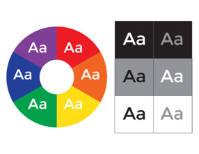
Leverage contrast. Choosing the wrong colors is the first mistake most people make in dashboard design. Good use of color starts with leveraging contrast because it makes your message clear.
Keep in mind that similar colors may be difficult to distinguish from one another. Start by choosing two colors that go together well. You can easily find these “complementary colors” using a color wheel (a popular resource for designers). Each color’s complementary color is the one directly opposite it on the wheel. For more resources on choosing colors, see Chapter 6.
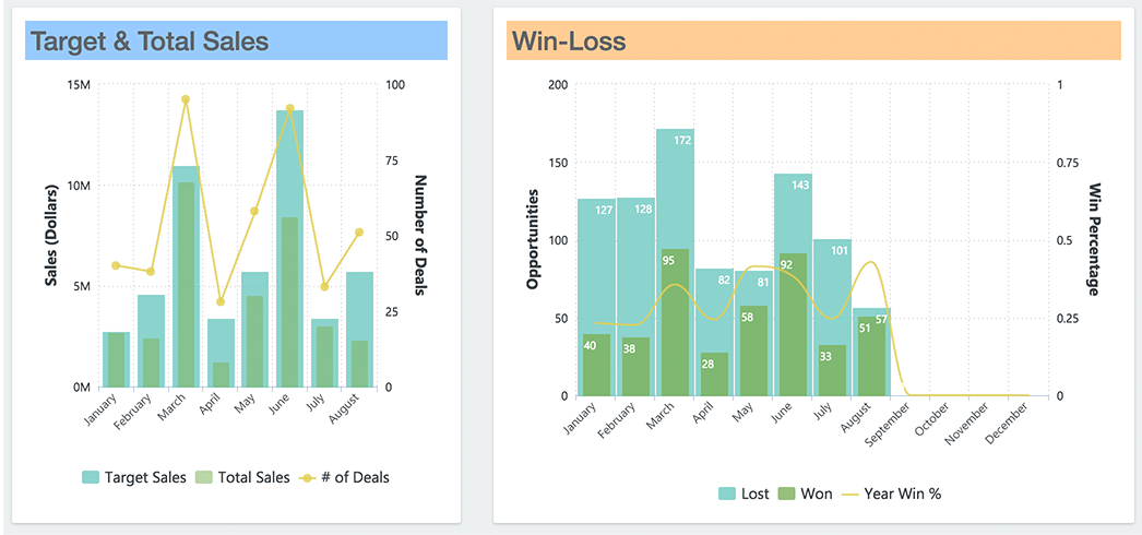
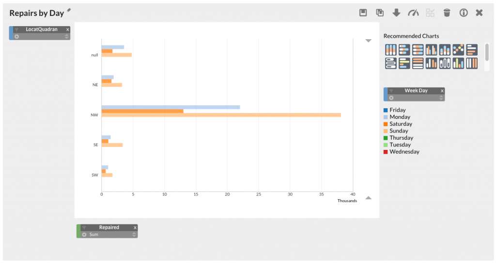
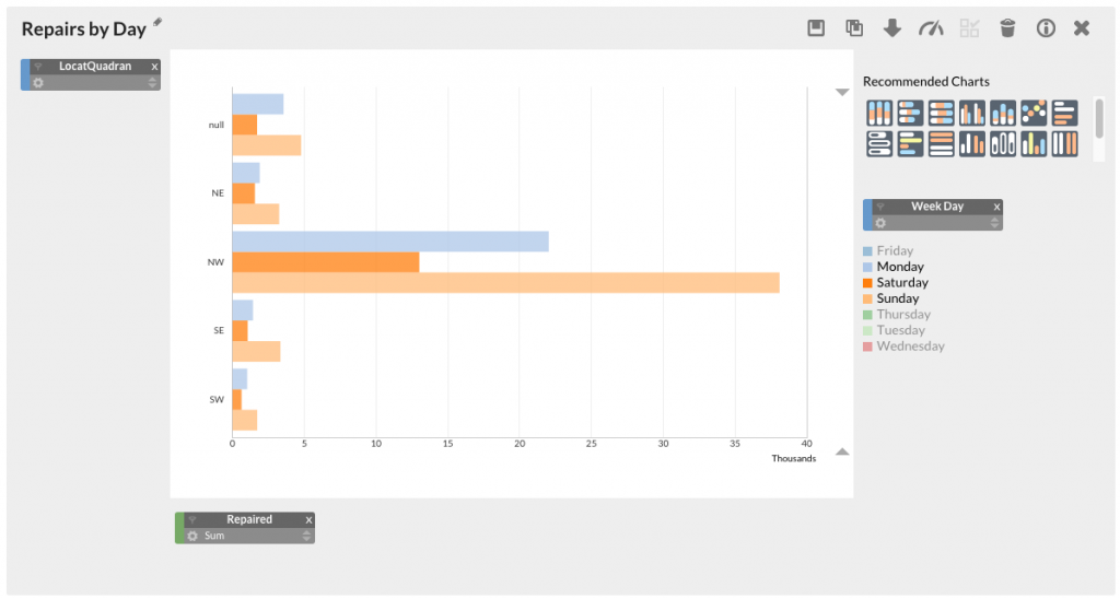
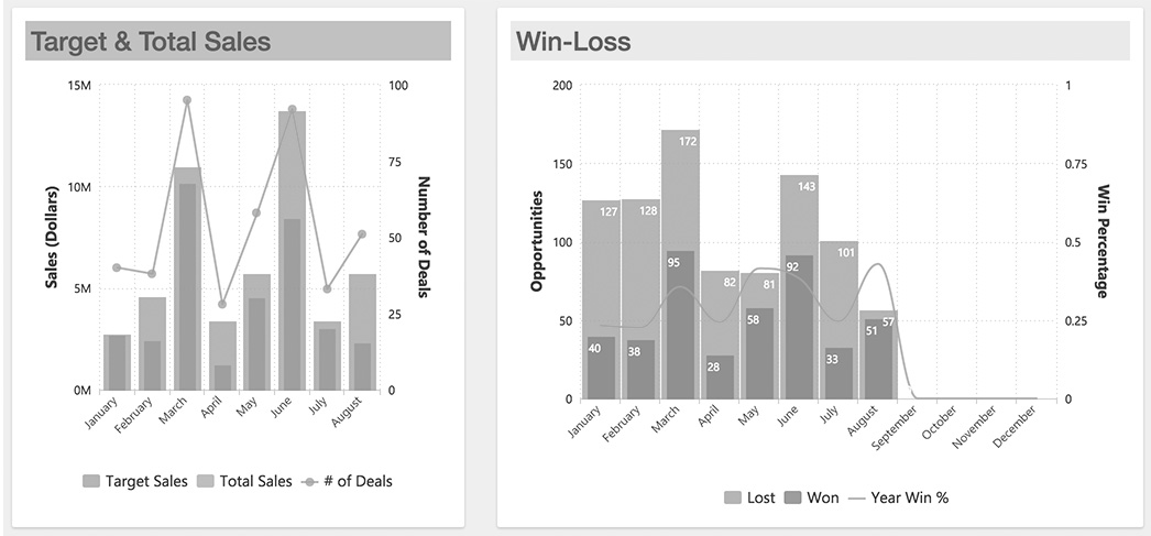
Use color sparingly. Color should only be used in a dashboard to serve a particular communication goal. For instance, when you’re highlighting something, you want one or more of the panels in your dashboard view to pop out. You can use color to accomplish this.
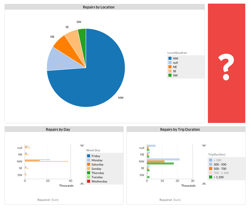
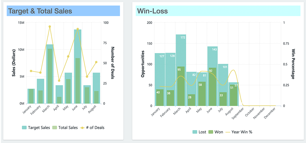
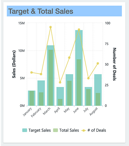
Or when you’re grouping items together, a stacked bar chart may be more appropriate. This example below highlights a chart that distinguishes between target and total sales from one another using color.
To be on the safe side, always use six or fewer colors in visualizations. Use any more, and it becomes difficult for users to see the differences. Use natural colors to display most of your information and reserve bright or dark colors to highlight outliers or important calls to action.
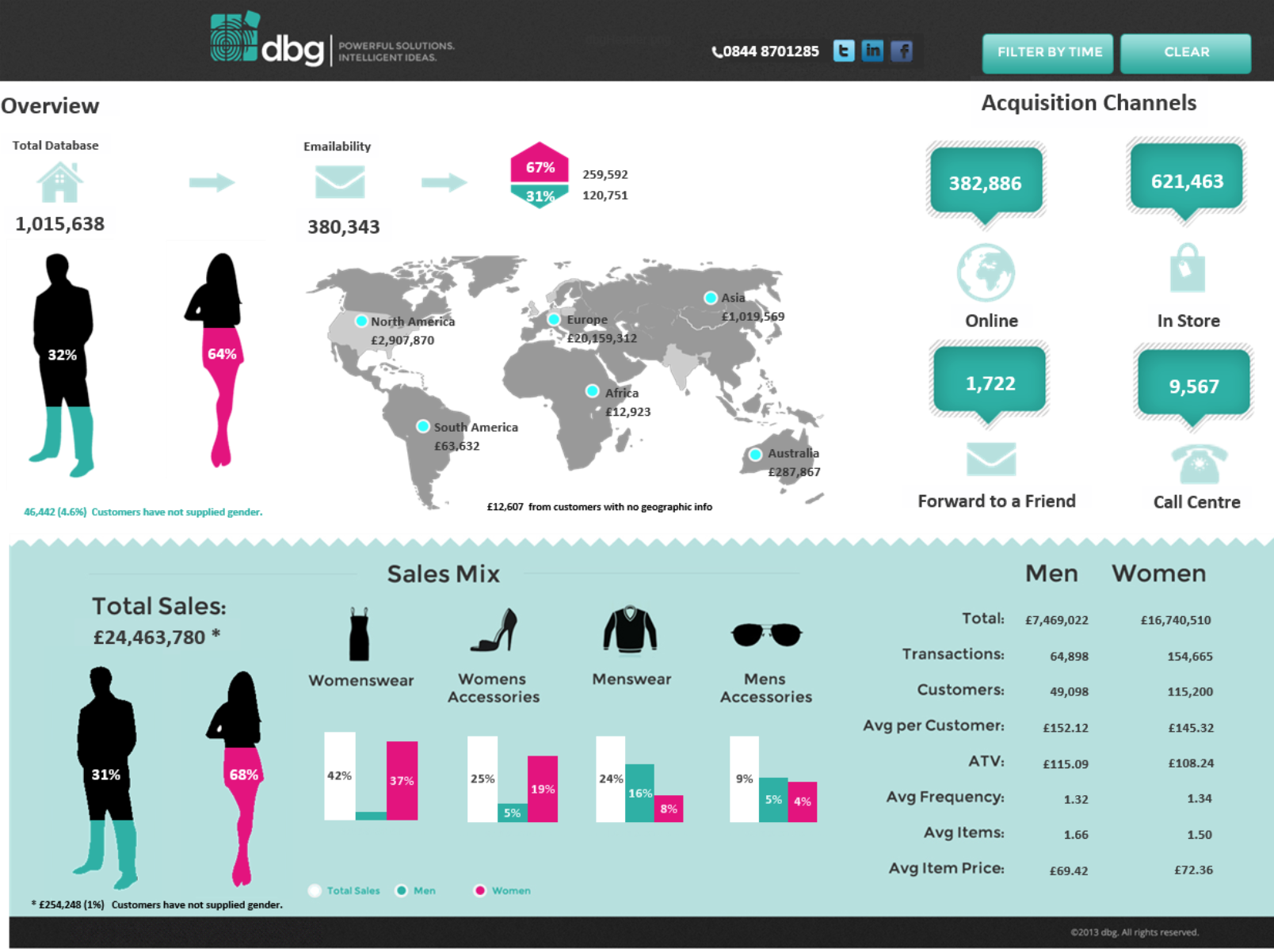
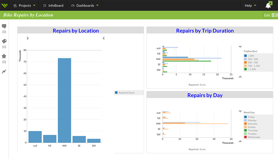
 Example: Geckoboard
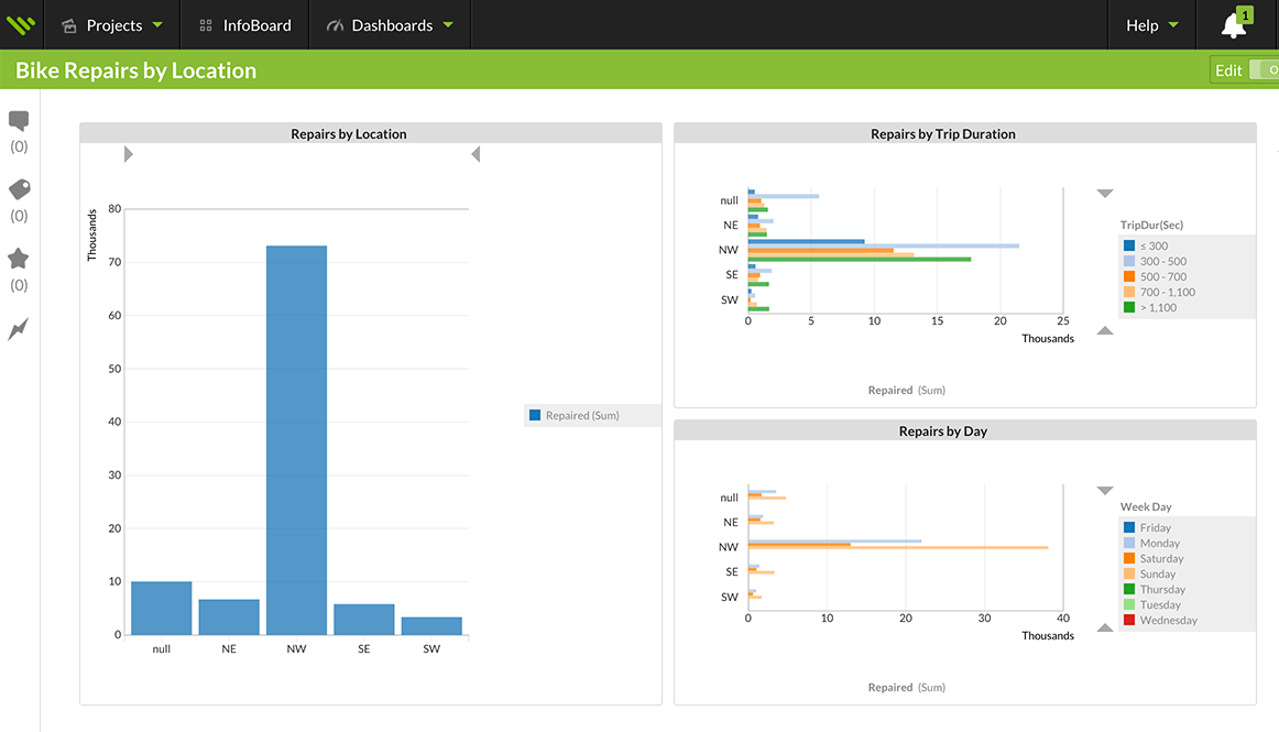
Whether you have one color or different colors on a table or graph, make sure the background color is consistent. Be wary of gradients and variants in backgrounds, which can make it hard to tell if colors are changing. Use a resource like the Adobe Kuler Color Wheel to create color schemes and browse color combinations.
Remember this: As long as you can answer the question, “What purpose does this color serve, and will it serve it effectively?” then your use of color is entirely appropriate.
Pay attention to meaning. Be cognizant of the colors you choose and the associations they carry. Take, for example, red and green: When North Americans look at these colors, we are already making a comparison in some way by linking red with “bad” and green with “good.” As another example, consider red and blue; many cultures may associate red with “hot” and blue with “cold.”
Use different colors only when you want to communicate differences in meaning. If you’re showing two different colors on a chart, they should always represent something different and meaningful.
Don’t be afraid to incorporate black and white into your dashboards. Many times, these colors work extremely well together, especially when you need to accentuate certain dashboard design elements.
Test for color blindness. Another reason not to overdo your dashboard design with color is to accommodate colorblind users. Roughly one in 20 people have a color vision deficiency. The world looks different to these people; for instance, they often find it hard to tell red and green items apart.
For your colorblind users, we suggest using a color blindness checker or simulator on your dashboard. One option is Color Brewer, which allows you to choose color schemes using pre-selected color sets that have been tested for color blindness and contrast. Another resource is Vischeck, which will simulate colorblind vision when you run your own image files or webpages through it.
Stick to one font. In dashboard design, the general rule is to use a single font type and no more than three sizes in that type.
Your goal is to create a visual hierarchy with all the content displayed in your dashboard. You can emphasize font copy by either bolding it or adding an accent color.
So, what font do you use? Most modern fonts belong to either the serif or sans-serif families. Serif fonts have a tail at the end of each letter, while sans-serif fonts do not. These font families serve different purposes:
Serif fonts are best for body text because the tail makes the text easier to read. Consequently, these fonts are used in the majority of books.
Serif Typeface
Lorem ipsum dolor sit amet, porttitor a in. Ante erat, fusce volutpat vitae, vestibulum et, donec nibh pellentesque nec corrupti vehicula sed. Donec condimentum turpis est leo cras tempor, malesuada duis ipsum eu arcu, nibh neque mauris.
Sans-serif fonts are designed for short blocks of text, such as headlines, because readers pay close attention to them. Road signs are typically set in Helvetica, a sans-serif font.
Sans-serif Typeface
Lorem ipsum dolor sit amet, porttitor a in. Ante erat, fusce volutpat vitae, vestibulum et, donec nibh pellentesque nec corrupti vehicula sed. Donec condimentum turpis est leo cras tempor, malesuada duis ipsum eu arcu, nibh neque mauris.
Naturally, the human eye will go toward whatever is largest. Regardless of the font you choose, your headlines should be larger than your body text.
If everything’s bold, nothing is
Lorem ipsum dolor
Mixing regular and bold for visual
Lorem ipsum dolor
Think about typography. While font is how you set your text, typography is how the font looks when you’re done. In other words, typography refers to adding emphasis and color to both the text and background. Let’s look at the basics of typography and how they apply to dashboard design.
Leading determines how text is spaced vertically between lines. Leave enough space so the words are legible, and remember to accommodate for any long descender letters like “g” or “p.” The general rule is that the leading should be 20 percent greater than the font size.
Kerning determines how you adjust space between individual letters. Always keep spacing proportional and uniform between letters. And remember that if your letters are spaced too close together, your text becomes difficult to read (the same is true, in a different way, if they are spaced too far apart).
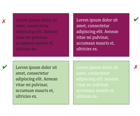
Putting fonts and colors together. When designing typography for a BI dashboard, it’s important to choose text and background colors that complement one another. Color adds another dimension to your text, whether for good or bad (for example, you wouldn’t want to have dark text on a dark background). By the same token, don’t use green text on a red background because it looks jarring and strains the human eye. For visual interest, you can mix regular and bold fonts. Just remember to use color or weight (not both) as the main point of emphasis in a sentence. If you bold the entire text of a sentence, nothing will stand out.